Master Data Management Portal
Sector
Healthcare
Simplified, Unified and Minimalist UI Design to increase user efficiency
Background and Challenge
It is a master data management portal for a leading healthcare service provider where their internal stakeholders raise and fulfill customer level requests during various sales lifecycles of the medical equipment.
The project intended on unifying the three distinct portals used across different geographies to accomplish the same workflows. The challenge was to justify the information hierarchy for the content-heavy interface.
Scope of work
The objective was to unify, simplify and update the old workflows to cope with technological advancements and remove redundant processes.
The UX design process was as follows:
- A field study to identify user pain points and behavior when performing the operations
- Task flows to better map out the actions of the users
- Information architecture and wireframes using the client's design system to design the application
- Simplified, Unified and Minimalist UI Design to increase user efficiency
Solution
Tata Elxsi designed a minimalistic and efficient system which included:
User Authentication : Adapted the designs to best fit client's Brand guidelines for a seamless and familiar experience.
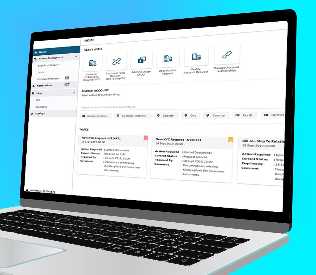
Home Screen: Modular approach, easy to access and guided navigation design, data prioritization, and color coding were done for key user tasks.
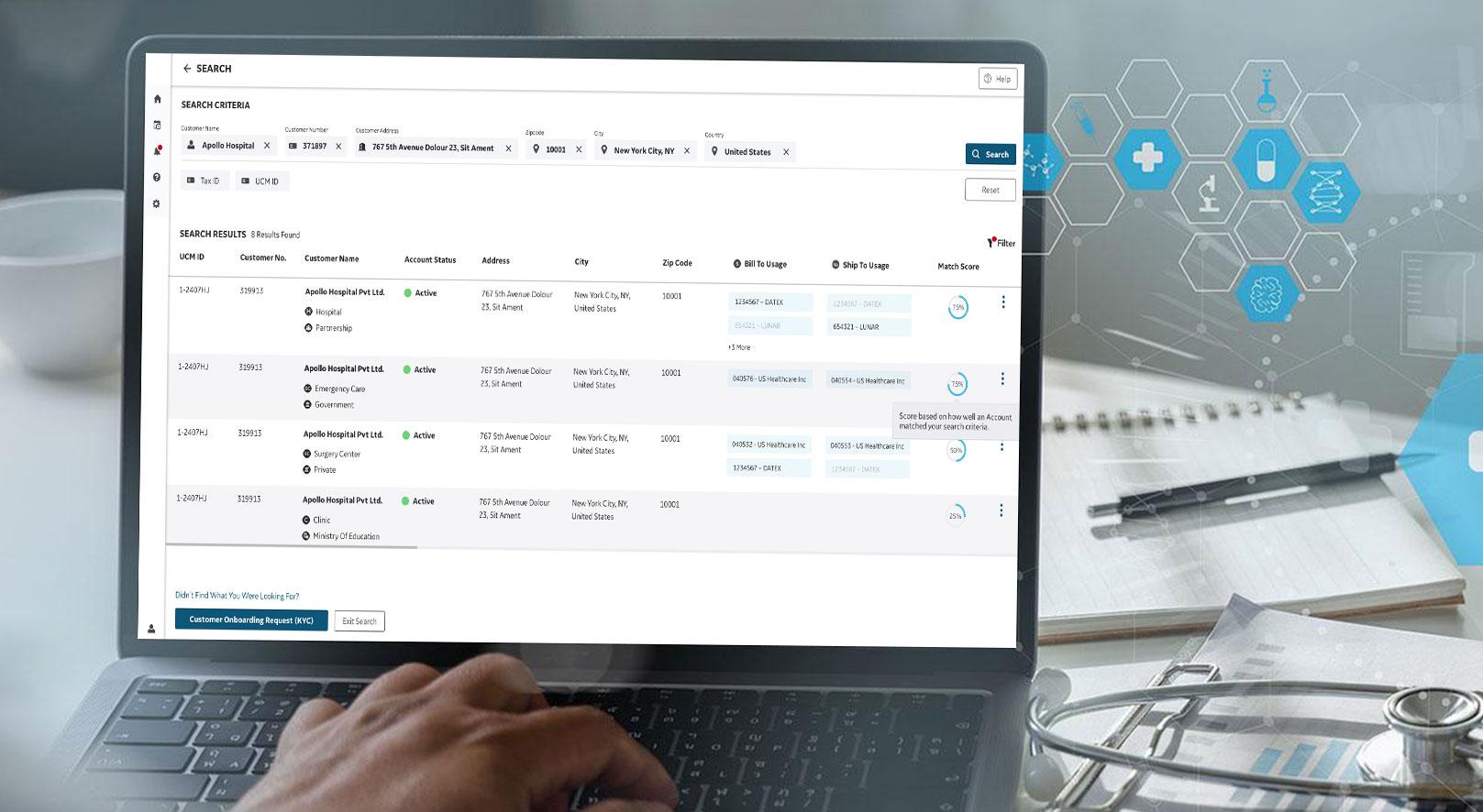
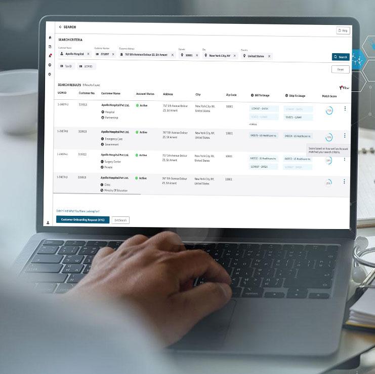
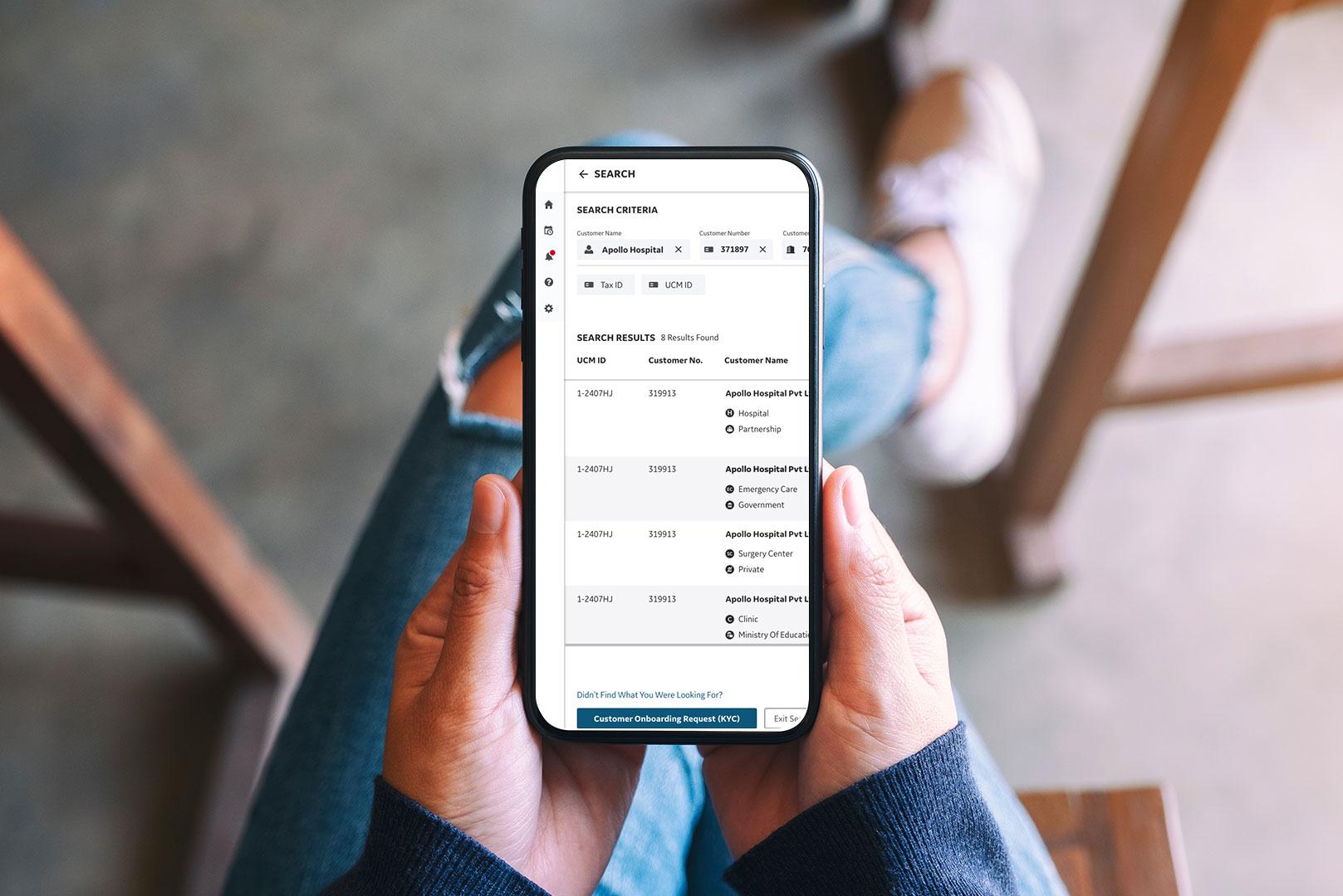
Search Criteria and Results: Data clustering for enhanced content consumption, use of iconography for visual aid, grid and tabular structure for content segregation and display.
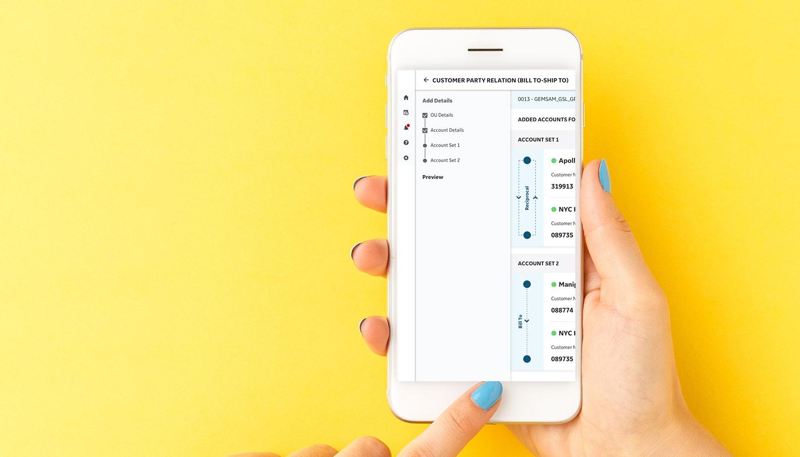
Relationship Workflow: Graphical representation for emphasizing concept rational, wizard design were developed to allow users to focus on the content pertinent to each step and decrease the chance of errors.
Impact
- Increase in Efficiency
- Reduction in operational errors
- Clarity in ownership of tasks thereby reduction in the operation time

